Landing Page
Prototype
Update the wireframes of the product purchase flow and redesign the website based on the insights obtained.


Stakeholder, Front-end Developer, Back-end Developer, UX Researcher, Visual Designer
UX Research, Paper + Pencil, Figma, Miro
Optimized workflow for purchasing electronic devices.
Product Designer, 2 months
My Role
Teams
Tools
My Results
The Challenge

The project aims to redesign the interface and user experience to improve the usability and efficiency of the system. Our focus is to provide an intuitive and enjoyable experience for users, making navigation and task completion within the platform easier.
What is it? What is it for? Why is it?


Getting to Know Hetp
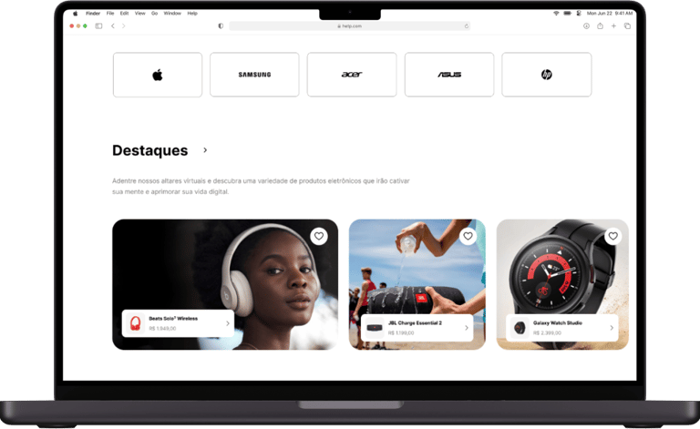
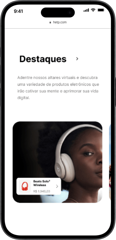
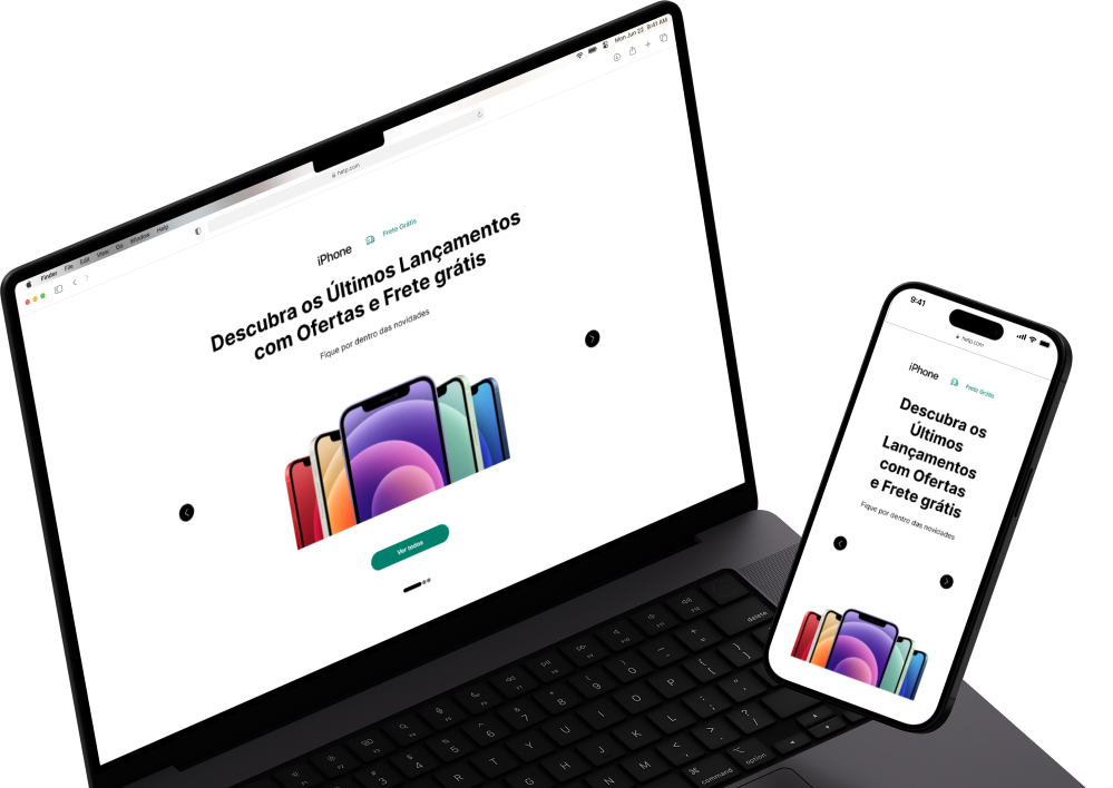
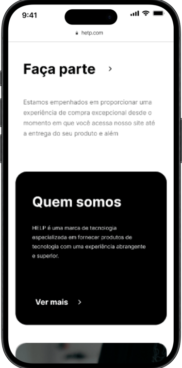
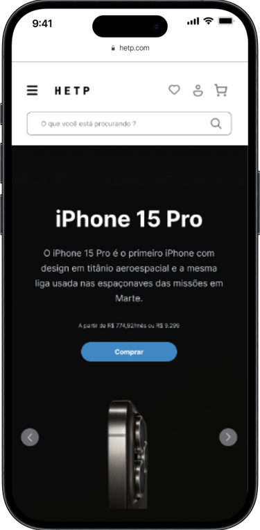
On the introduction screen, you will find a modern and intuitive interface designed to provide an exceptional browsing experience from the first click.

Varieties of Options
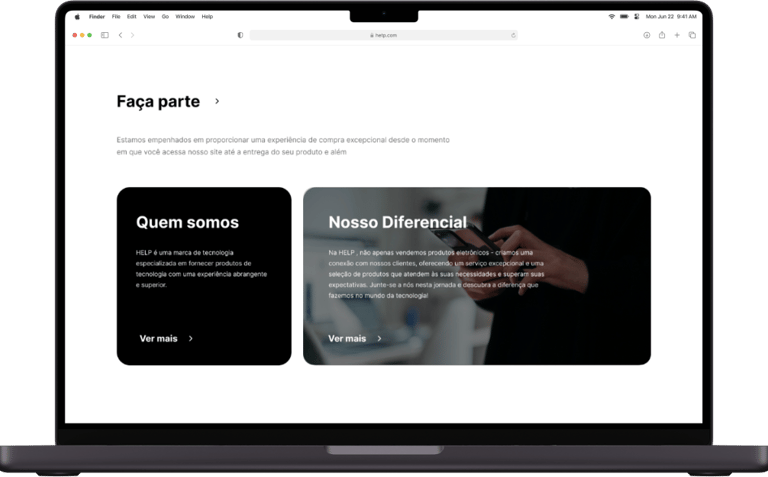
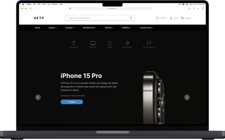
Browse through a wide selection of mobile phones, laptops, and electronic accessories, carefully categorized to make your search easier.
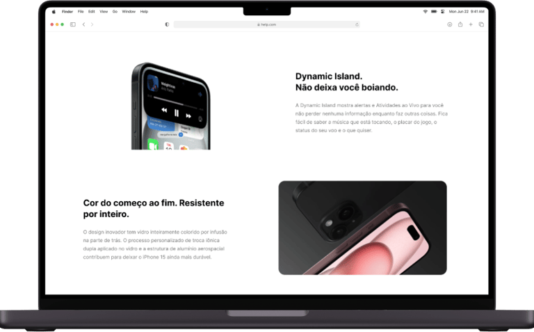
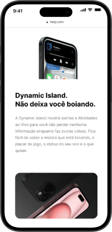
Device information
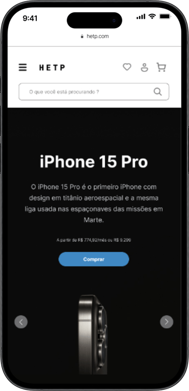
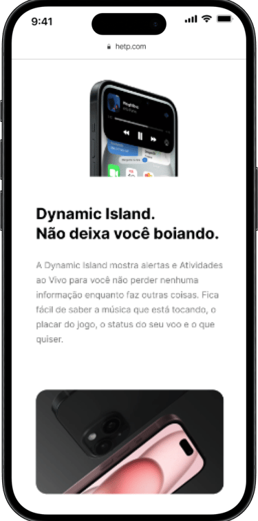
Here, I highlight the latest releases, such as the new iPhone with Dynamic Island, which offers an immersive user experience with real-time alerts and enhanced multitasking.
Goal Setting.
Business vs. UX
First and foremost, to create a meaningful project, it is crucial to understand the interests involved.
I worked to align the business goal and created the UX goal accordingly.
Action
Result
Be clear in creating high-fidelity prototypes, seek relevant user data, and create an intuitive and simplified design.


Business Goals
Understand the brand's needs and integrate them naturally into the design.


Create high-fidelity prototypes based on the wireframes already created.
User Experience Goal
What are the objectives?
Synthesizing Feedback


"At High End Place, we aim to create a modern and captivating platform in the short term that can make a significant impact on customers. Our goal is to offer a wide range of products, ensuring that the platform is intuitive and easy to use, leaving no room for doubt about its usability."
Long Term
Context
In the long term, we aim to be recognized as leaders in online shopping for high-quality and technology products. We plan to expand our product range while maintaining a commitment to service excellence and prioritizing customer satisfaction. Additionally, we are constantly innovating, aiming to provide an increasingly personalized and enjoyable shopping experience.
Stakeholder
Stakeholder
Challenge
Create the high-fidelity prototype based on the already created wireframes.
Home
Home's page


The wireframes are already done, but due to some research data, we will need to redo some points before creating the high-fidelity prototypes. These changes will be based on data and metrics collected from users.

Sales Channel
Product Page
Who is the audience?
Gather user information.
We aim to create a simple, intuitive, and aesthetically pleasing interface. Some keywords that may describe it are:


How to improve the shopping experience?
"Easy usability of the system is crucial; no doubt should be left for the user on how to find a product."
"A clean interface where users can shop easily."
"Greater navigation flexibility."
Data
Relevant data obtained.


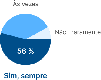


Approximately 17 people participated in our survey, and many decisions were made based on this data :
Do you usually read reviews and comments from other users before making an online purchase?
Do you prefer to buy from a well-known brand or are you open to trying lesser-known brands?
What influences your choice of store, and how do you usually decide which store to buy from?


Argumentation
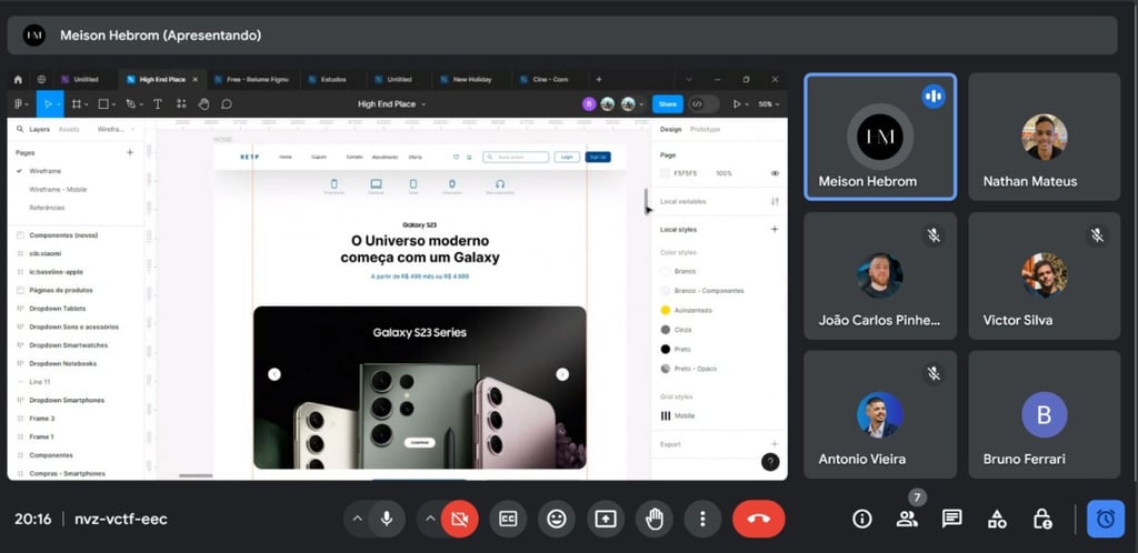
Meetings between teams are necessary for goal setting.
Based on the results obtained from users about the best way to improve the product, it was necessary to adopt a different approach. I suggested creating a more obvious and simple feature based on user information so that they feel more in control when accessing the website.

Persona
Key Insights in a Persona.
João is a young and active consumer who values an efficient and hassle-free online shopping experience. He seeks clear information and detailed comparisons to make informed choices, especially when it comes to electronics like computers.
Additionally, he is open to trying lesser-known brands if they offer good value for money but prefers to rely on reviews and comments from other users to guide his decisions.
Buying Behavior
João is an active online consumer, making purchases of electronics a few times a year. He prefers using his phone for shopping but also occasionally uses his computer. His online purchases generally focus on accessories, such as headphones, and mobile phones.


João Rodriguez
25 anos, Digital Influencer


Needs
João values an efficient purchasing process. He expects to find clear information about products, especially regarding computer processing capabilities.
Wants
João values reviews and comments from other users when making purchase decisions, relying on shared experiences to guide his choices. He prefers well-known brands when buying electronics. To decide which online store to purchase from, João primarily relies on online reviews, prioritizing the reputation and reliability of the store.
Style Guide
Consistency
in UI Kit.
Typography


Colors
Icons
The UI kit is my visual compass, guiding all my design decisions. It goes beyond simple rules; it is a living document that captures the essence of my brand, transforming it into tangible visual elements. Here’s how I use it and why it is crucial for the success of my project:


Market Analysis
A Market Competing in Sets.
Apple
Apple’s website is known for its minimalist and elegant design. Navigation is intuitive, with a focus on products and an easily accessible search bar.


Samsung
Samsung’s website typically features a more colorful and dynamic design compared to Apple. Navigation can be somewhat more complex due to the wide variety of products.
Dell
Dell’s website tends to be more conservative in terms of design, with a more corporate approach. Navigation is clear and straightforward, with well-defined categories for different products and solutions.
The competitive audit revealed its strengths and weaknesses compared to direct competitors. By implementing the suggested recommendations, HETEP can improve its position relative to other cinema apps, providing a more comprehensive, personalized, and satisfying experience for users.
Constant innovation and adaptation to customer demands will be key to ongoing success.
Deliver
Final Experience.
Some changes were necessary to make the product more aligned with user needs.
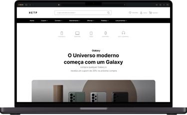
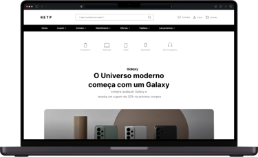
Upon Opening the Site
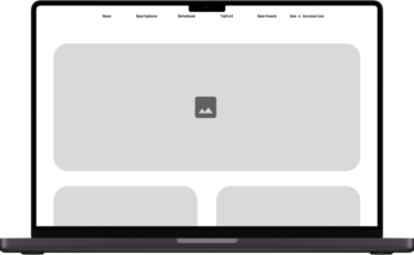
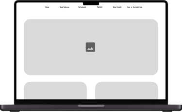
My main goal was to create a striking and welcoming first impression. I chose a clean and modern layout, featuring a prominent image of a smartphone and a laptop in a stylish environment.


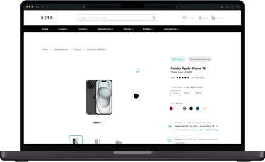

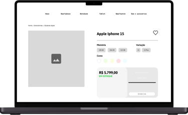
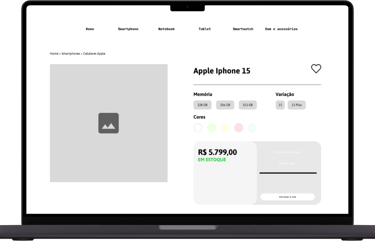


Description
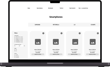
I used a product grid with thumbnail images that can be enlarged when hovered over, allowing users to examine product details.
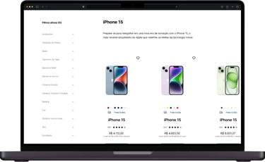
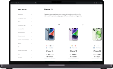
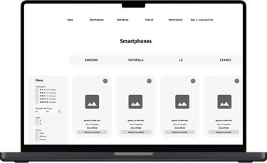


Products
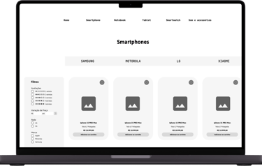
I used a grid layout to display products in a visually appealing and organized manner. Each product is presented with a large image, descriptive title, price, and customization options, where applicable.
Project Conclusions
A deeper understanding of ideas when placed within context.
The project naturally began as an extensive study in behavioral sciences. From the start, I proposed that we dedicate 80% of our time to research to deeply understand our target audience and analyze our competitors' market positioning. After validation and additional testing with our users, we found that contextual insights and user feedback were as, if not more, valuable in identifying opportunities and ideas that shaped the project's generation phase.


